Communication Mark

Communication Mark

The SIAF2020 communication mark is a visual representation of the festival theme of “Of Roots and Clouds,” designed to help audiences understand it better. More than simply a symbol of SIAF2020, the icon functions as a messenger conveying the festival theme. This is why it is called a “communication mark,” rather than a logo.
Shaped by the intertwined images of roots and clouds, the icon expresses how each plays a role indispensable to the other. The blue color was chosen to reflect the fact that the 2020 festival is taking place for the first time during winter as well as to symbolize Sapporo’s stunning clear skies. Look closely and you can see, nestled among the clouds, the four letters of “SIAF”.
Though we tend to think of a single “sky blue,” there are actually a great variety of blues. We held many discussions with the festival team and the directors, to decide which shade of blue to use. The18th-century Swiss scientist Horace Bénédict de Saussure invented the cyanometer, a device for measuring the blueness of the sky, which served as an inspiration for what we did. Namely, rather than an image of the sky, we re-recognized the actual color of the sky in the natural world. Taking its reproducibility in print also into account, we ultimately selected the traditional Japanese color of sora-iro (sky blue). This color is a pigment originally made long ago from crushed rocks and meant to represent the color of the afternoon sky on a fine day. We perceived this blue as the main color for the festival: SIAF blue.
The communication mark incorporates a sense of being something that utilizes its organic expression and can be freely adapted for a wide range of scenarios in the future. Please look forward to how it will be subsequently used.
Through this communication mark, artists and audiences will learn about SIAF2020, participate in the festival, cherish it, and coexist with it. It is our hope that the icon becomes such a bridge for communication.
WABISABI
Graphic Designer
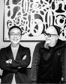
Wabisabi was formed in 1999 by Ryohei “Wabi” Kudo and Kazushi “Sabi” Nakanishi. Wabisabi’s wide-ranging creative activities span advertising, graphic design, art, video, music, interior design, and fashion. The team is part of Deza-in Co., Ltd., the company that Wabi runs. Wabi also serves as a director of the Japan Graphic Designers Association, and both Wabi and Sabi are on the Sapporo Art Directors Club Steering Committee. The pair’s numerous accolades include the 85th NY-ADC Award (Silver), 86th NY-ADC Award (Merit Award), International Poster Triennial in Toyama 2006 (Gold), Taipei International Poster Festival (Bronze), International Poster and Graphic Arts Festival of Chaumont, Lahti XVI Poster Biennale, D&AD Face to Watch 2009, JAGDA New Designer Award 2005, 1st Tokyo Midtown Design Award (Second Prize), and Sapporo Art Directors Club Competition (Grand Prize, Runner-up).