About Sapporo International Art Festival
What is the Sapporo International Art Festival
The Sapporo International Art Festival サイアフUsa Mosir un Askay utar Sapporo otta Uekarpa in Ainuis an initiative that introduces opportunities for discovery, learning, and participation by exhibiting artworks and new forms of expression from around the world in Sapporo. Centered around the triennial art festival, サイアフ also collaborates continuously with schools, local communities, and businesses to cultivate a creative environment within the city.
Since 2025, the festival’s activities have been organized into three frameworks
Festival
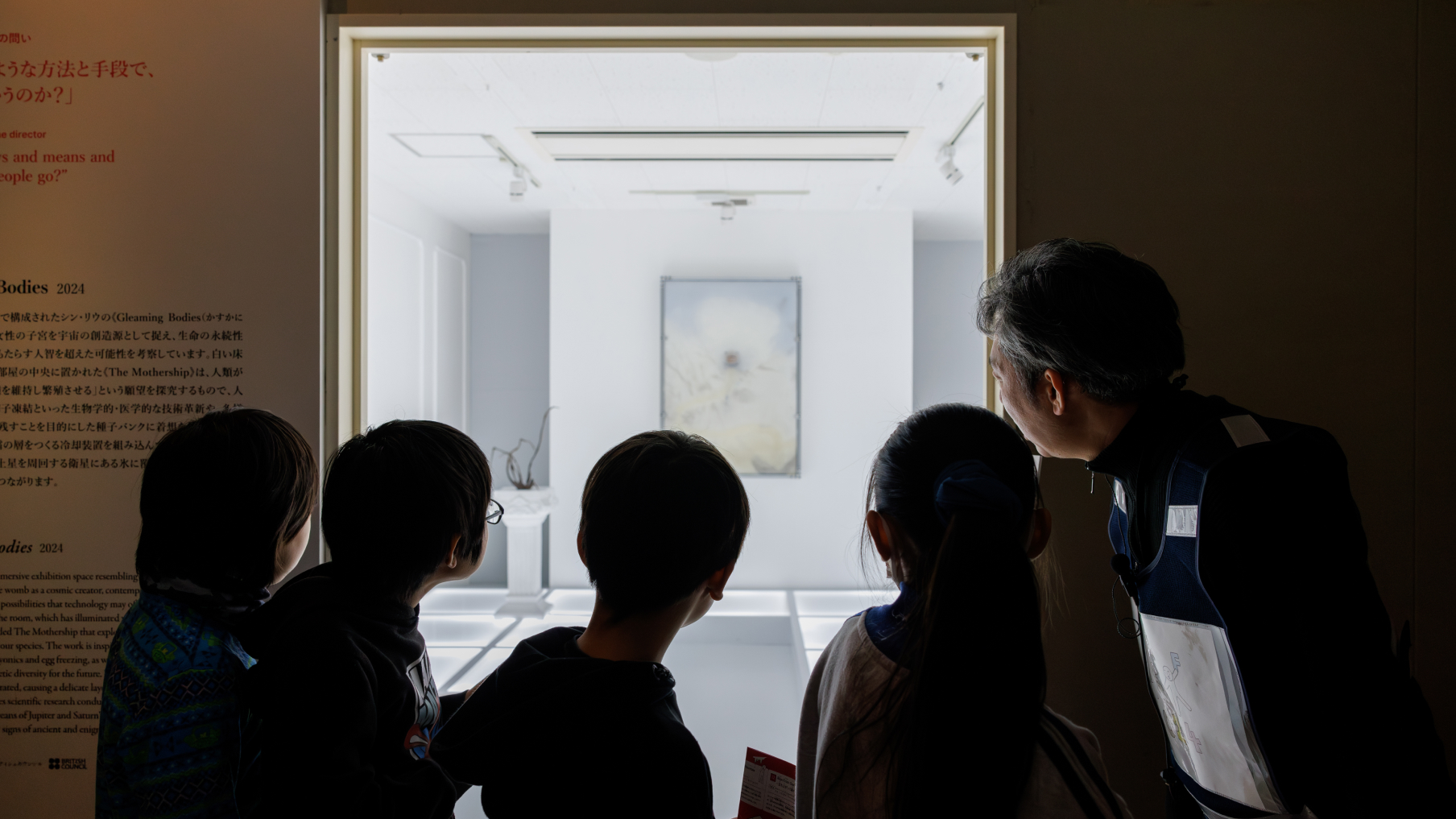
Every three years, サイアフ hosts a festival that allows people to experience art and new forms of expression from around the world. Deliberately held in winter since サイアフ2024, the festival embraces Sapporo’s snowy landscape and harsh natural environment, transforming it into the stage and source of inspiration for the artworks. The works displayed not only encompass traditional forms of art, such as painting and sculpting, but also modern technologies like computers, the internet, and AI. These pieces invite us to reflect on our rapidly changing society, our daily lives, and our existence as human beings.
Exhibitions and events take place in a multitude of venues across the city, including museums, parks, public facilities, underground spaces, former theaters, and even snow storage facilities, thereby expanding the possibilities of Sapporo as a creative city.
School

At サイアフ, “citizen participation” has long been a guiding subject, offering diverse programs for different ages and interests to engage with the festival. Building on this, サイアフ has launched サイアフ School, an initiative that envisions the festival as a “school of the future.”
More than just a triennial festival, サイアフ School aims to be a space where art intersects with our everyday life and education. Through collaborations with artists, citizens, schools, and local governments, サイアフ School offers opportunities for discovery, experience, and learning for everyone.
Studio
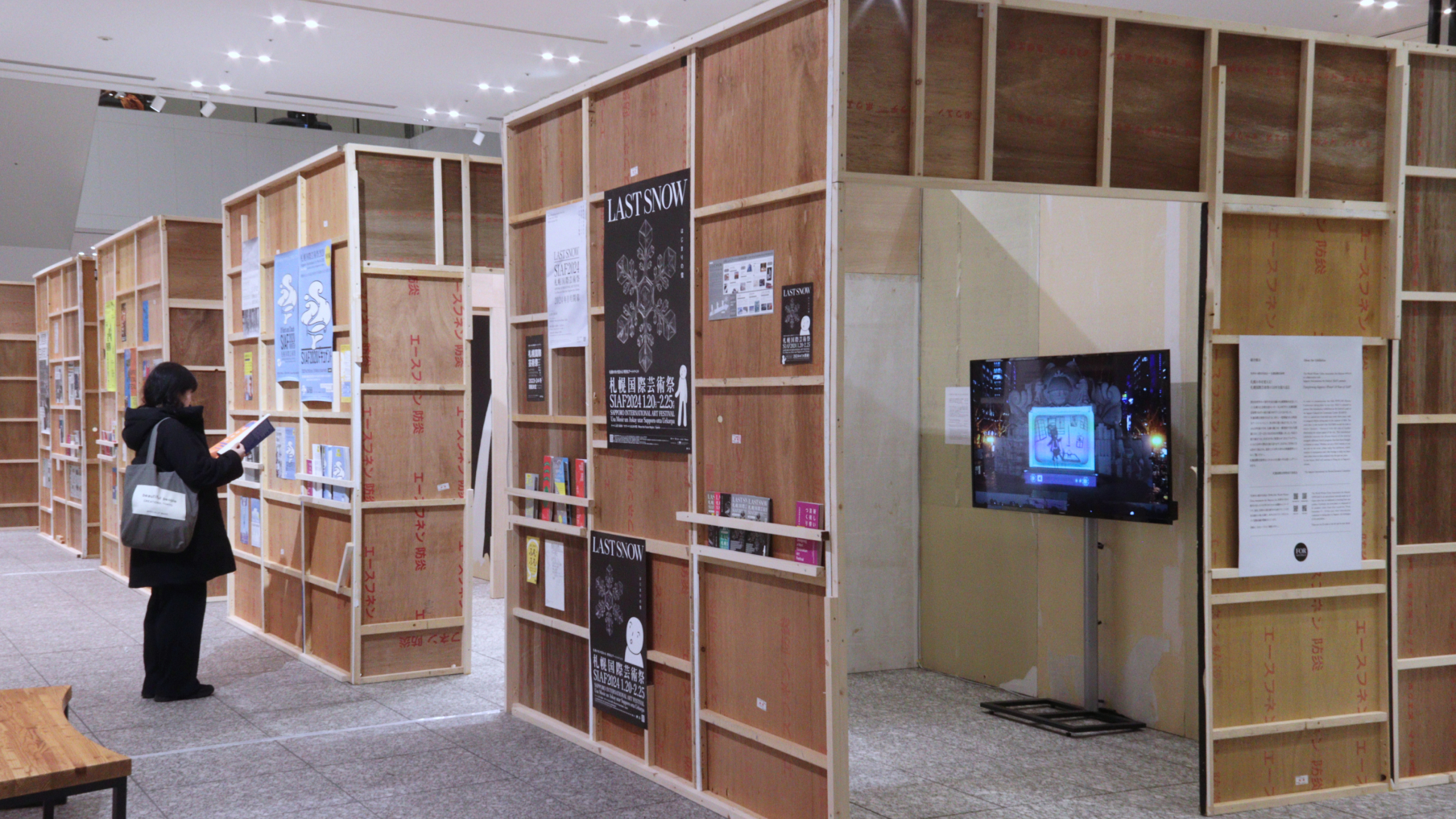
Photo by Noriko Takuma
The festival’s vision and the artists’ expressions are supported and actualized by the expertise that backs them. サイアフ Studio provides the technical foundation necessary to bring the festival’s concepts and ideas to life through exhibitions and events.
Its activities span a wide range designing and constructing exhibition and event spaces, collaborating with companies, and engaging in research and development to explore future forms of expression. By rethinking the art festival from a technical perspective, drawing on local history and everyday life, and sharing knowledge with the community, サイアフ Studio aims to serve as an experimental hub for new and emerging possibilities.
Aim of サイアフ
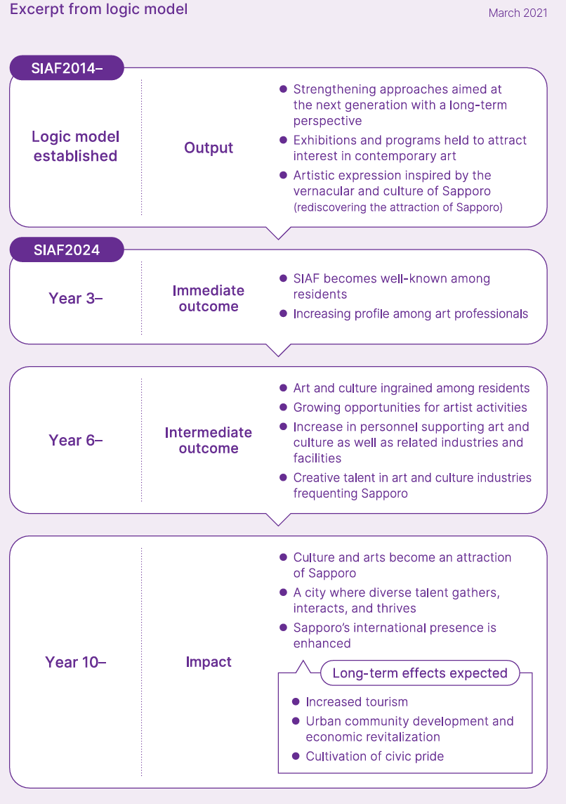
サイアフ is more than just an art event it’s a long-term initiative to enrich the future of Sapporo through art. Its plan is structured into three steps to transform the city.
Step 1 Creating Catalysts
The festival will first foster an environment that nurtures citizen engagement with art. At the same time, サイアフ will strive to create a festival that reflects Sapporo’s unique identity and gains recognition both domestically and internationally.
Step 2 Cultivating a Cultural Foundation
Building on these achievements, the next step is to shape Sapporo as a “city of cultural arts.” This means deepening citizens’ interest in art, expanding opportunities for artists, and creating a positive environment that gathers creative talent and related industries.
Step 3 Impacting the Future
Ultimately, サイアフ aims to increase Sapporo’s international presence through the power of art. By becoming a hub where diverse talents converge and new challenges emerge, capturing the world’s attention, Sapporo will grow into a global city.
Together, these efforts aim to boost tourism, invigorate the economy, and promote civic pride.
サイアフ Up to Now
Over the years, サイアフ has welcomed a diverse range of directors. One of their essential responsibilities is setting the theme that indicates the direction of the festival. Based on サイアフ’s fundamental vision of “city and nature,” as stated in the “Basic Concept of Sapporo International Art Festival working title,” the director develops the festival’s theme through their own ideas and perspective. This theme then serves as the foundation for selecting participating artists and works.
Available only in Japanese
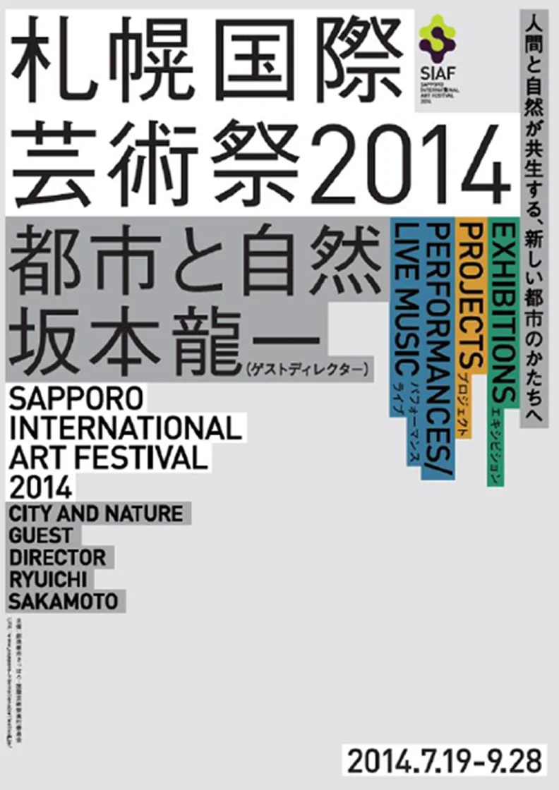
サイアフ2014
Theme City and Nature
Sub-theme Nature/City/Economy, Community and Life
Guest Director SAKAMOTO Ryuichi
Period July 19 - September 28, 2014 72 days
The first edition, サイアフ2014, brought together internationally active artists and presented works and programs across the city, offering experiences that had rarely been seen in Sapporo before.
サイアフ2014 welcomed musician SAKAMOTO Ryuichi as its Guest Director. The festival featured not only his own works, such as Sensing Streams - invisible, inaudible SAKAMOTO Ryuichi, MANABE Daito and Forest Symphony in Moerenuma SAKAMOTO Ryuichi, YCAM Interlab, but also a larger variety of works, such as FOGSCAPE 47412 NAKAYA Fujikowhich generated fog that blanketed the environmentand Kogaru Park in Nature YCAM Interlab, IGARASHI Juna temporary wooden playground for children.
The festival welcomed not only local citizens but also numerous visitors from across Japan and abroad, many of whom enjoyed cutting-edge art alongside the citys unique charm.
@2x.webp)
サイアフ2020 Canceled
Theme Of Roots and Clouds Sinrit/Niskur Ainu
Director Team
AMANO Taro Curatorial Director of Contemporary Art and Director in Chief
Agnieszka KUBICKA-DZIEDUSZYCKA Curatorial Director of Media Art
TAMURA Kanoko Director of Communication Design
Period December 19, 2020 - February 14, 2021 58 days
サイアフ2020 aimed to tackle new challenges, including hosting the festival in the snow-covered winter, establishing a three-member director team, and appointing local museum curators as festival curators. サイアフ2020 reflected on the nature and history of Sapporo and Hokkaido, as well as the challenges society faces in both the present and the future. Through the imagery of “roots” spreading across the land, “clouds” floating in the sky, and the world that lies between, サイアフ2020 created a space for people living in the here and now to re-examine society through art. Under the concept of “art mediation,” サイアフ also strived to develop programs that would connect audiences with the art festival.
However, due to the COVID-19 pandemic, the festival was unfortunately canceled. While it could not be realized, a record book and website were produced to present the full scope of サイアフ2020.
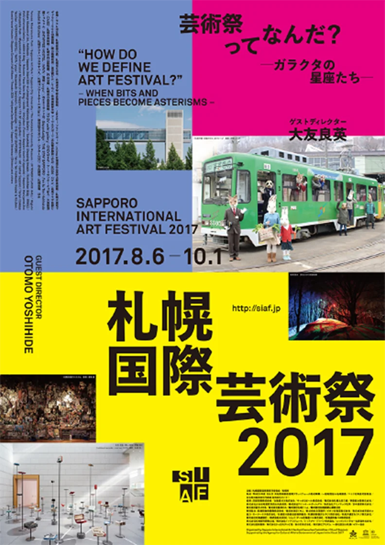
サイアフ2017
Theme How do we define “Art Festival”
Sub-theme When bits and pieces become asterisms
Guest Director OTOMO Yoshihide
Period August 6 - October 1, 2017 57 days
In 2017, OTOMO Yoshihide, the composer best known for creating the soundtrack for the NHK morning drama Amachan, served as Guest Director. OTOMO themed the art festival around the question “How do we define ‘Art Festival’” and focused on citizen participation, inviting each of them to seek their own answer.
Citizens participated in the early planning stages of projects, such as the Sapporo Collective Orchestra, which placed children at its core, or the O-furoshiki Project, where citizens donated fabrics to collectively create a large wrapping cloth O-furoshiki.
Over the course of 57 days, the entire festival transformed into a dynamic, living venue, with something happening every day.
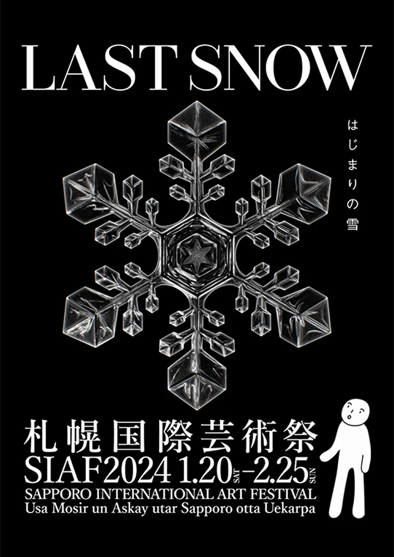
サイアフ2024
Theme LAST SNOW
Sub-theme はじまりの雪 Japanese
Where the Future Begins English
Upaste Ainu
Director OGAWA Hideaki
Period January 20 - February 25, 2024 37 days
Sapporo Art Museum December 16, 2023 - March 3, 2024
Sapporo Snow Festival Odori 2-chome Site February 4 - February 11, 2024
After a six-year hiatus, サイアフ returned with サイアフ2024, the first edition to be held in the winter. Under the direction of OGAWA Hideaki, the festival explored the themes of “LAST SNOW,” “Where the Future Begins,” and “Upaste,” using climate change, along with Sapporo’s climate and culture, as entry points to question visions of our future society through art and technology.
The Higashi 1-chome Theater was transformed into the “Future Theater” while five other venues across the city, such as Moerenuma Park, served as main venues for exhibitions. The festival also launched サイアフ School, an initiative designed to nurture the next generation. Through collaborations with the Sapporo Snow Festival and exhibitions that highlighted the appeals of snow and winter, サイアフ2024 presented new possibilities for a winter city.
Why an International Art Festival in Sapporo
A Foundation Born From Citizens’ Passion
サイアフ’s roots date back to the 1970s. Artists in Sapporo, aspiring to work on the world stage, were driven by a strong desire to “host an international art festival in this city” and began organizing independent activities.
By the 2000s, this enthusiasm had developed into concrete efforts to build a foundation for the festival. An art school was established to nurture the next generation, and artists-in-residence programs were created to welcome artists from around the world to Sapporo. Public spaces, such as the Sapporo Odori 500-m Underground Walkway Gallery in the heart of the city, were designed to provide citizens with opportunities to engage with art in their everyday lives.
Finally, an exhibition for the realization of an international art festival was held in 2006, steadily building momentum.
Sapporo’s “Creative City Sapporo” Vision
The festival is also deeply tied to city development. Sapporo believes that “the richness of the city lies in the creativity of each individual.” The city has placed this concept of the “Creative City” as the basis of its urban strategy.
To share this vision globally, Sapporo became the first Asian city in the UNESCO Creative Cities Network UCCN to join the field of media arts. With its balance of nature, urban functions, universities, and IT industries, Sapporo offers a unique appeal among the UCCN media arts cities. サイアフ was thus envisioned as an essential opportunity to symbolize “Creative City Sapporo” and “city of media arts,” showcasing its creativity to both citizens and the world.
Realization of the First Sapporo International Art Festival
The passion of artists and citizens, combined with the city’s strategic vision, culminated in June 2012 when the city of Sapporo announced the “Basic Concept of Sapporo International Art Festival working title,” and in 2014, the inaugural Sapporo International Art Festival was held.